Daraz: Redesigning ecommerce experience in Nepal during the COVID 19 pandemic
Ecommerce · UX Design · UX Research · Heuristic Evaluation · Mobile Prototype · Usability Test
Introduction
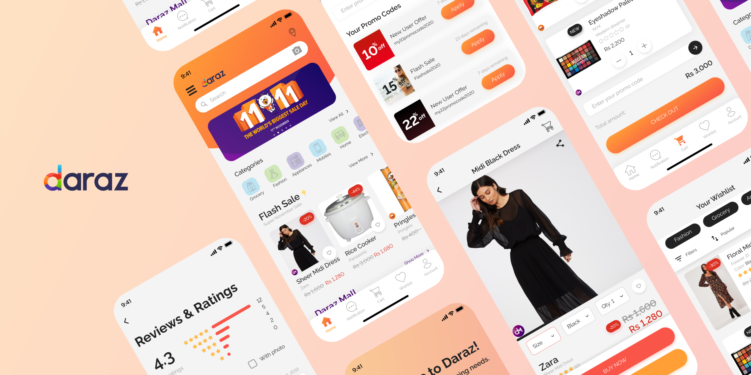
During the COVID-19 pandemic crisis, people in Nepal were still struggling to order the essentials through online services and this led me to look for the underlying cause for this problem. My primary focus was to understand why users don't want to switch to online services and where were these applications falling short to satisfy these user needs. Thus, I analyzed and re-imagined the e-commerce service- Daraz mobile application to achieve a much more responsive UI and improve the user experience through research and design processes.
How Might We help users switch to online shopping services and satisfy their needs in Nepal?
My Role
Understanding the problem, conducting User interviews, analyzing app reviews & suggesting design changes to improv the UX of the app.
Team
Designer & Researcher. Daraz designer as POC
Timeline
May 2020
UX Research
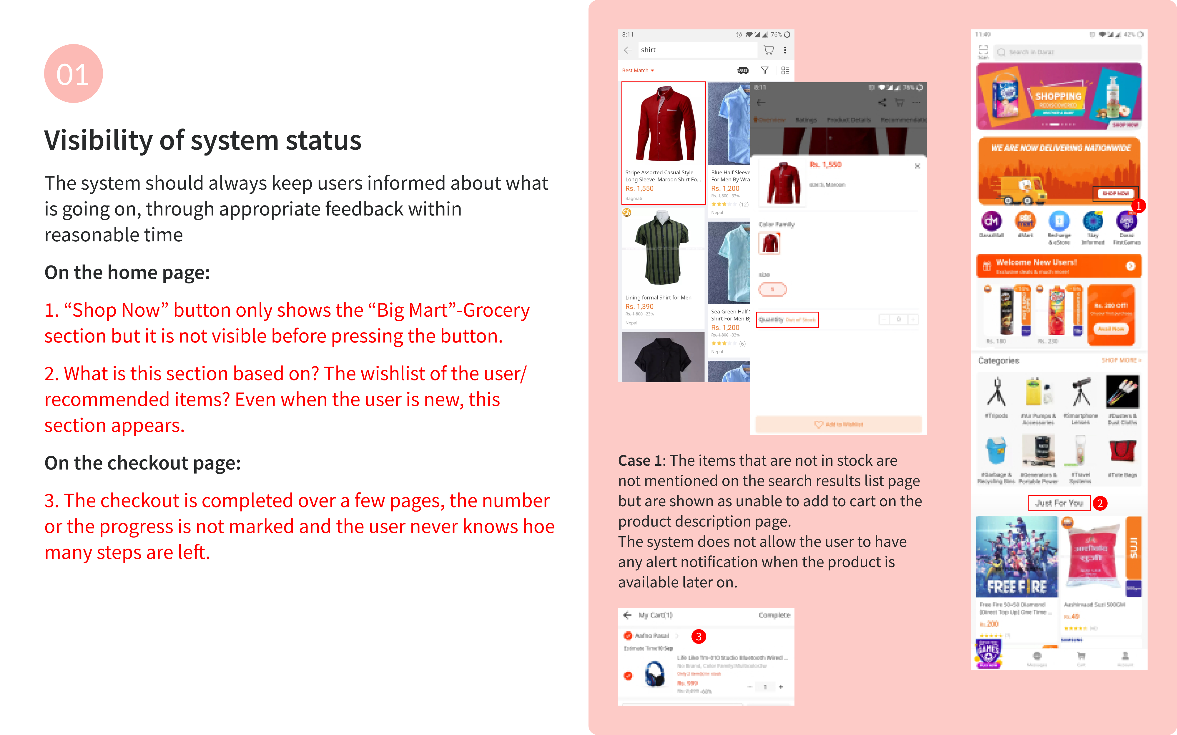
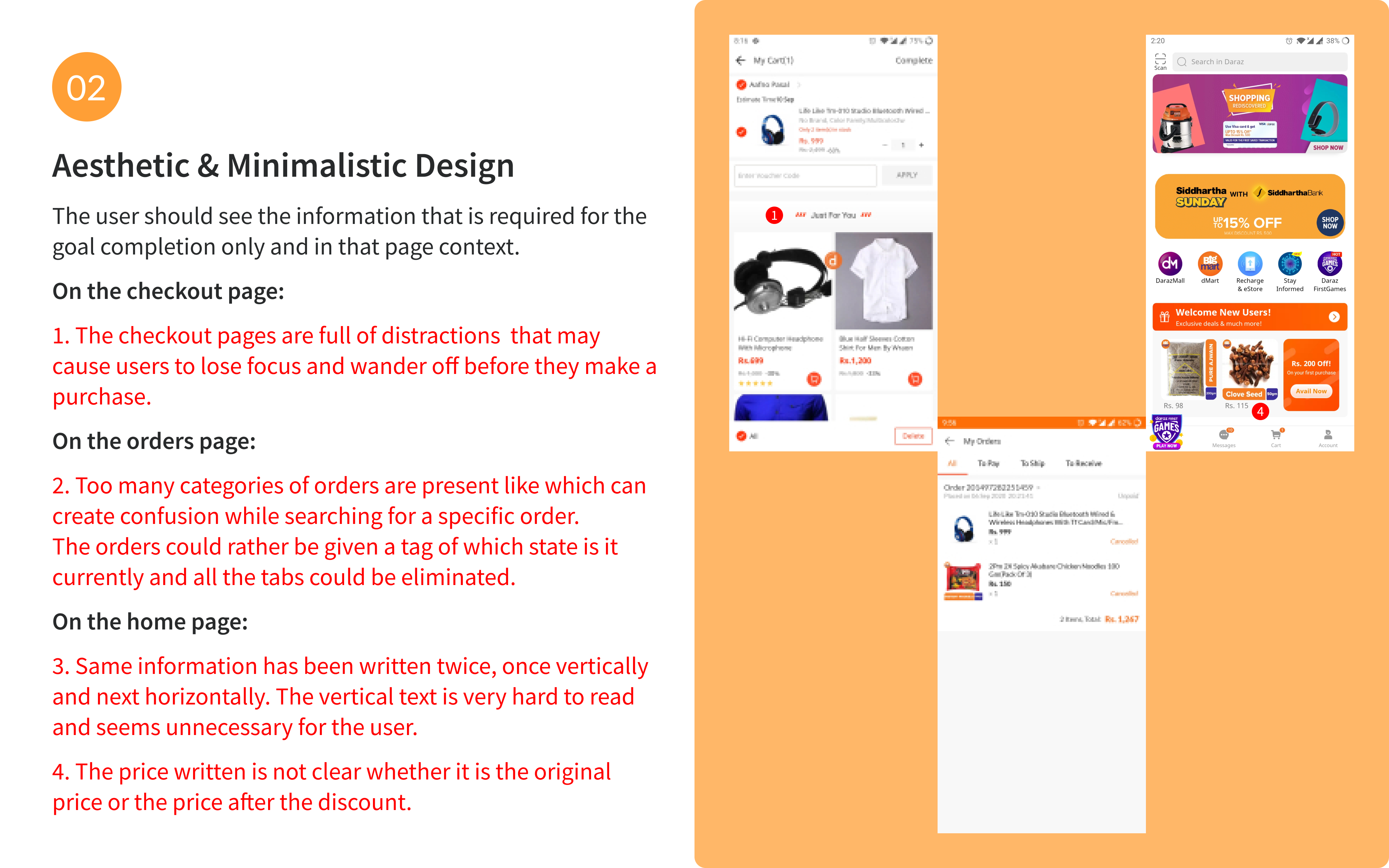
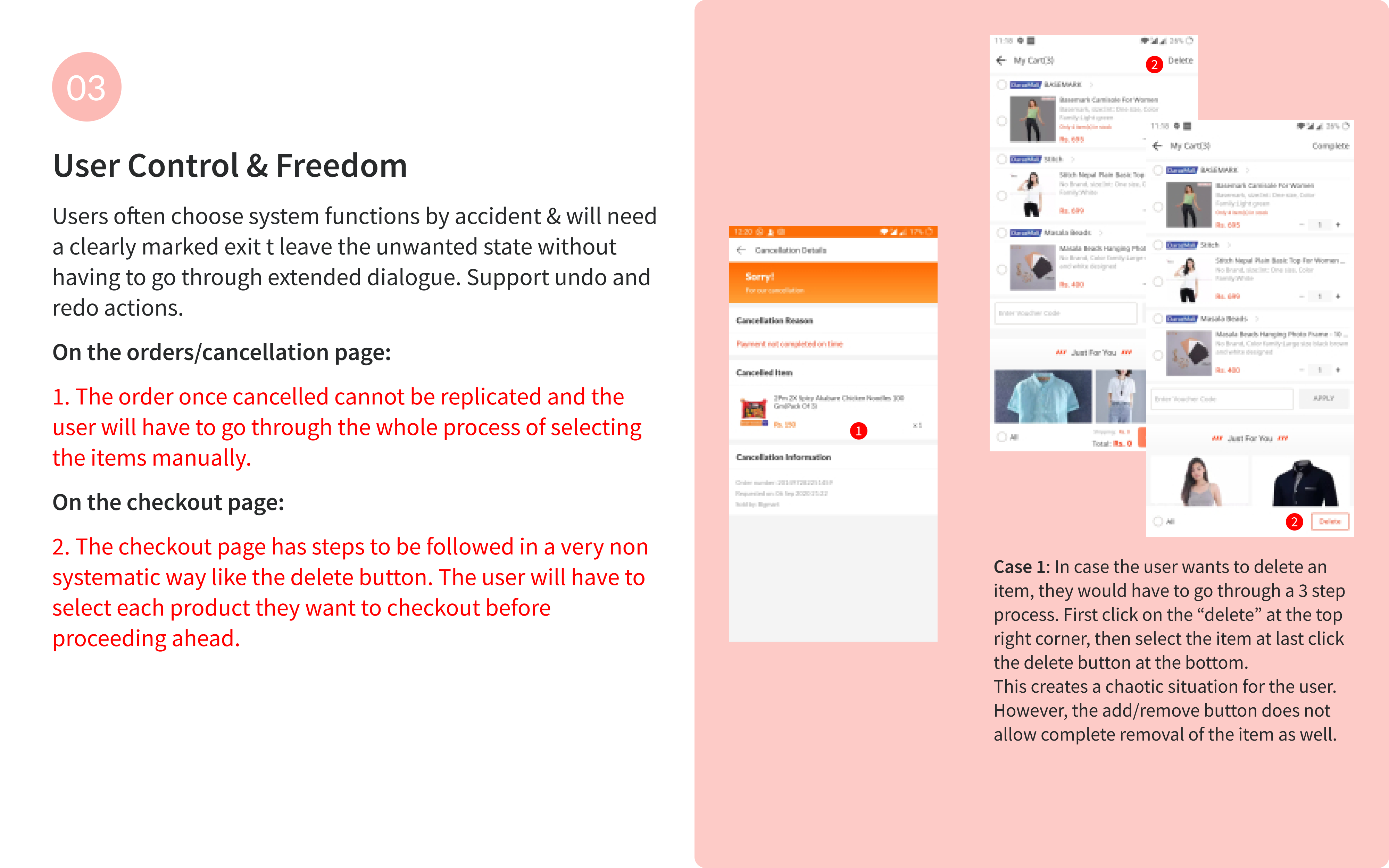
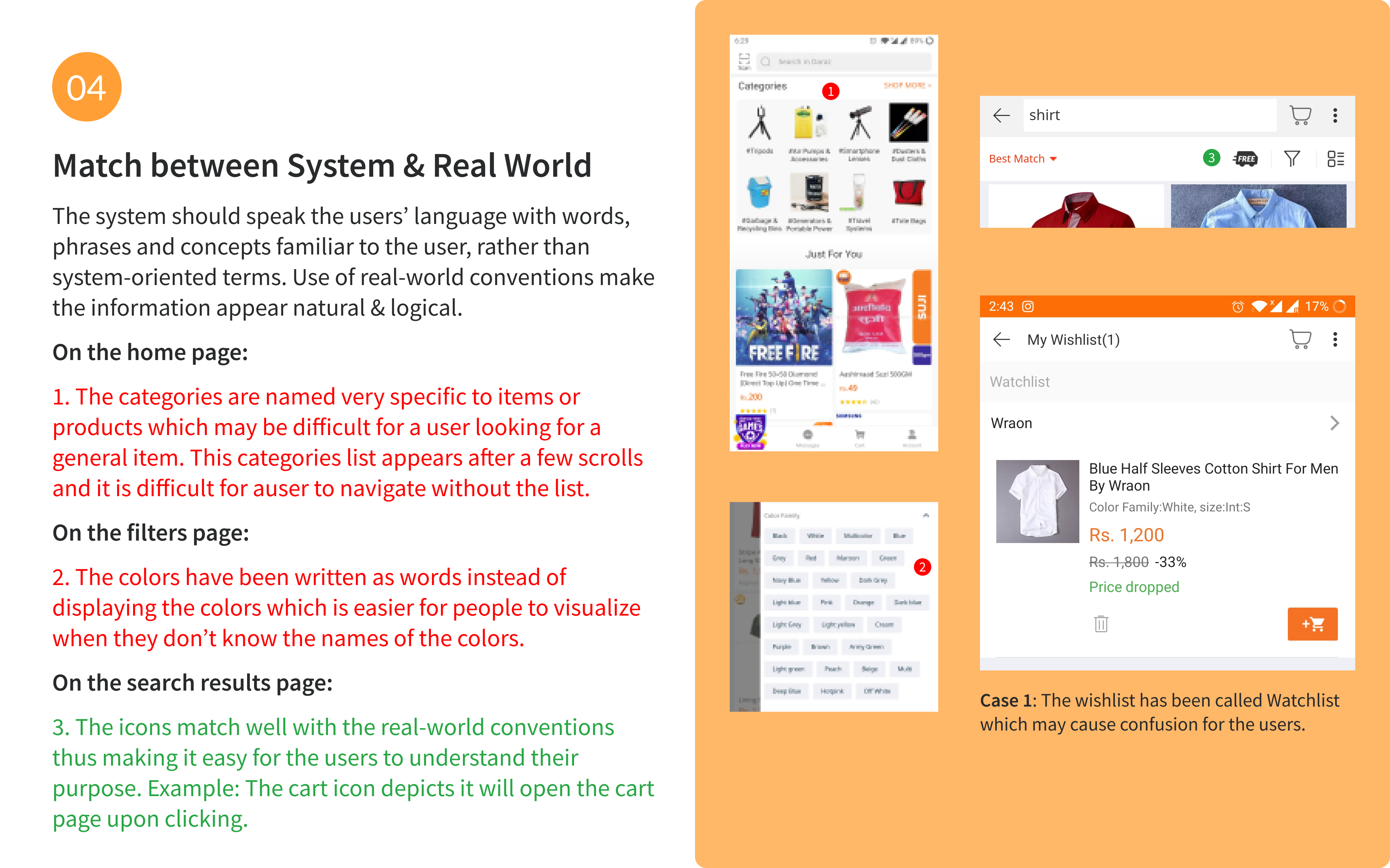
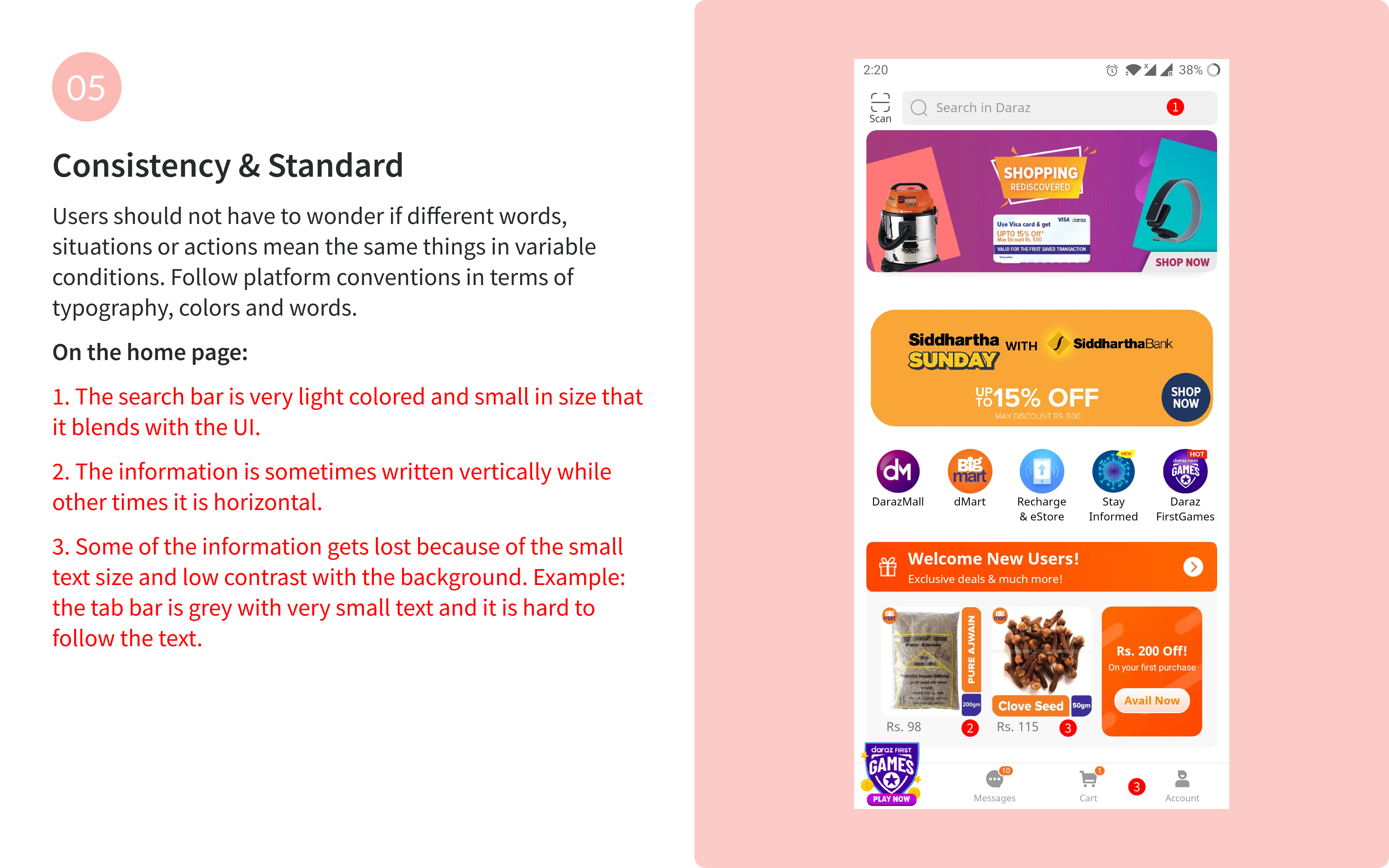
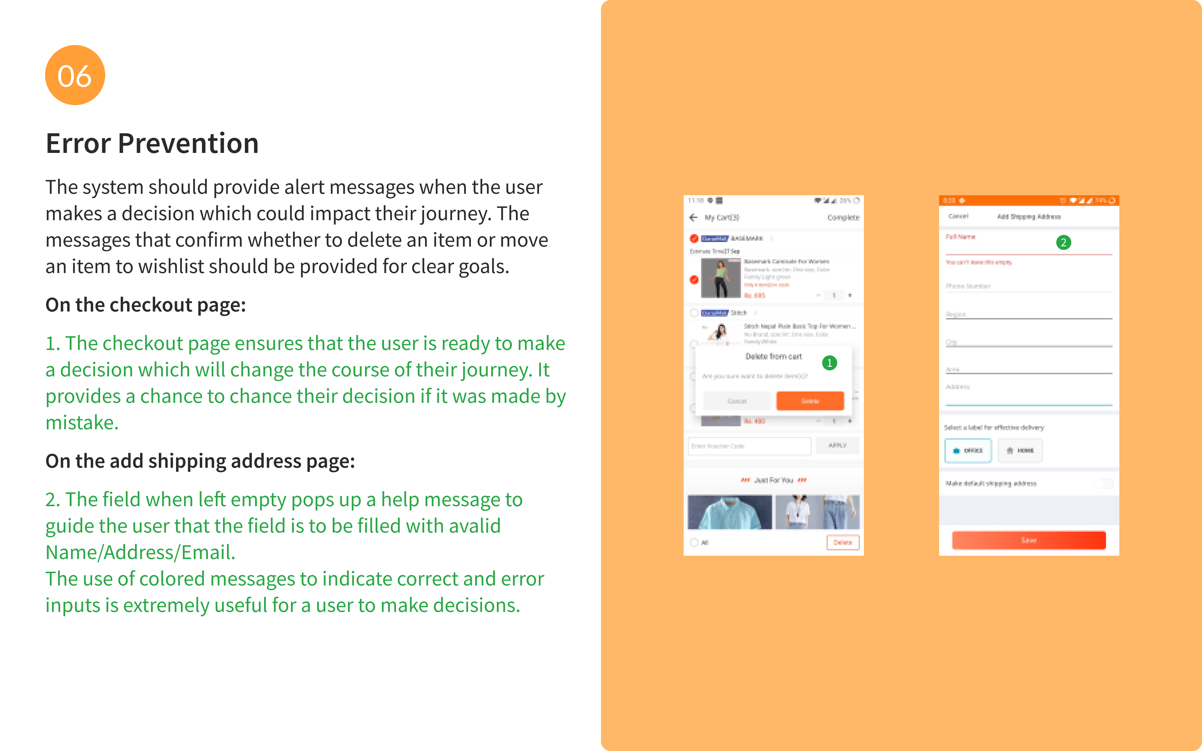
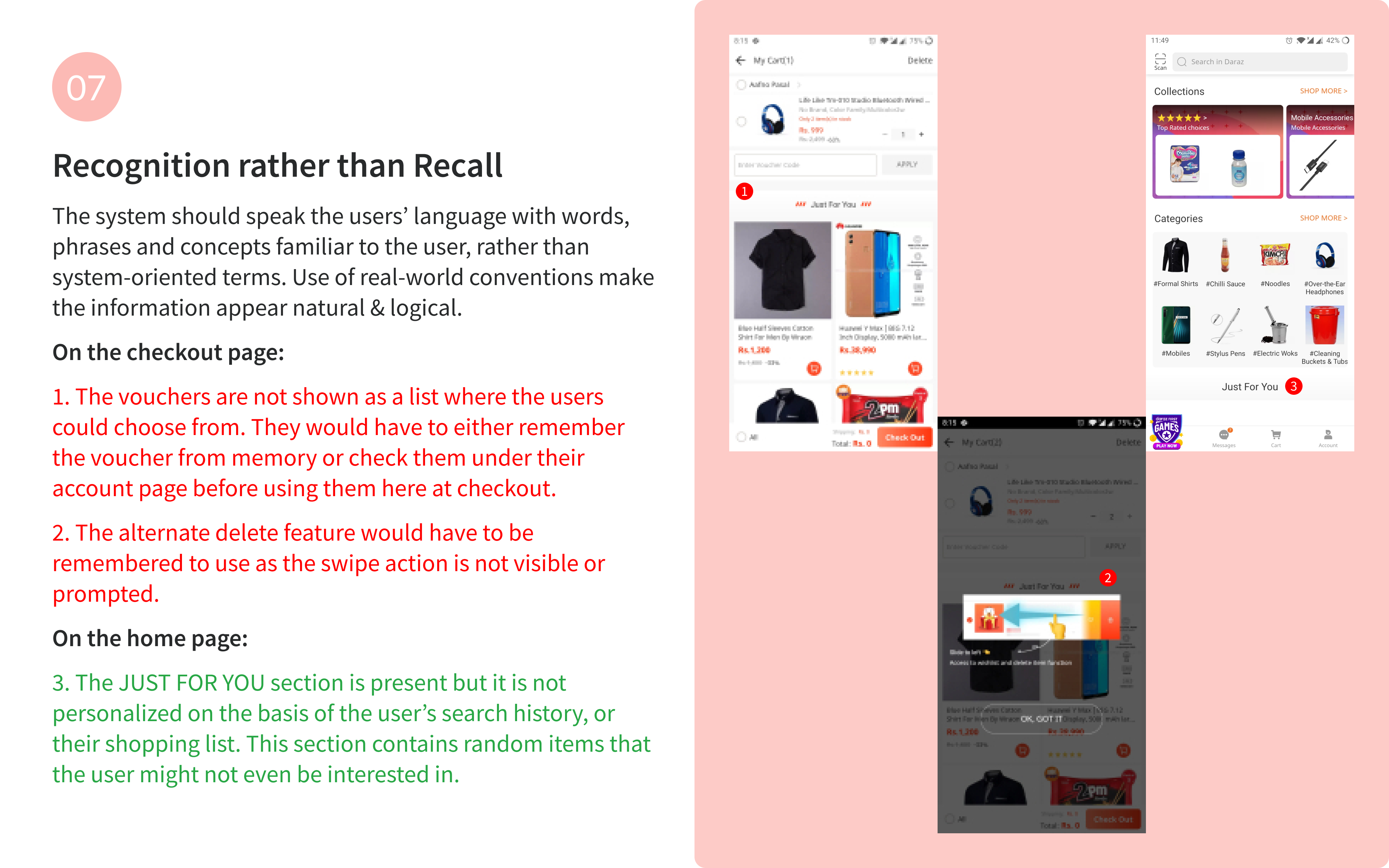
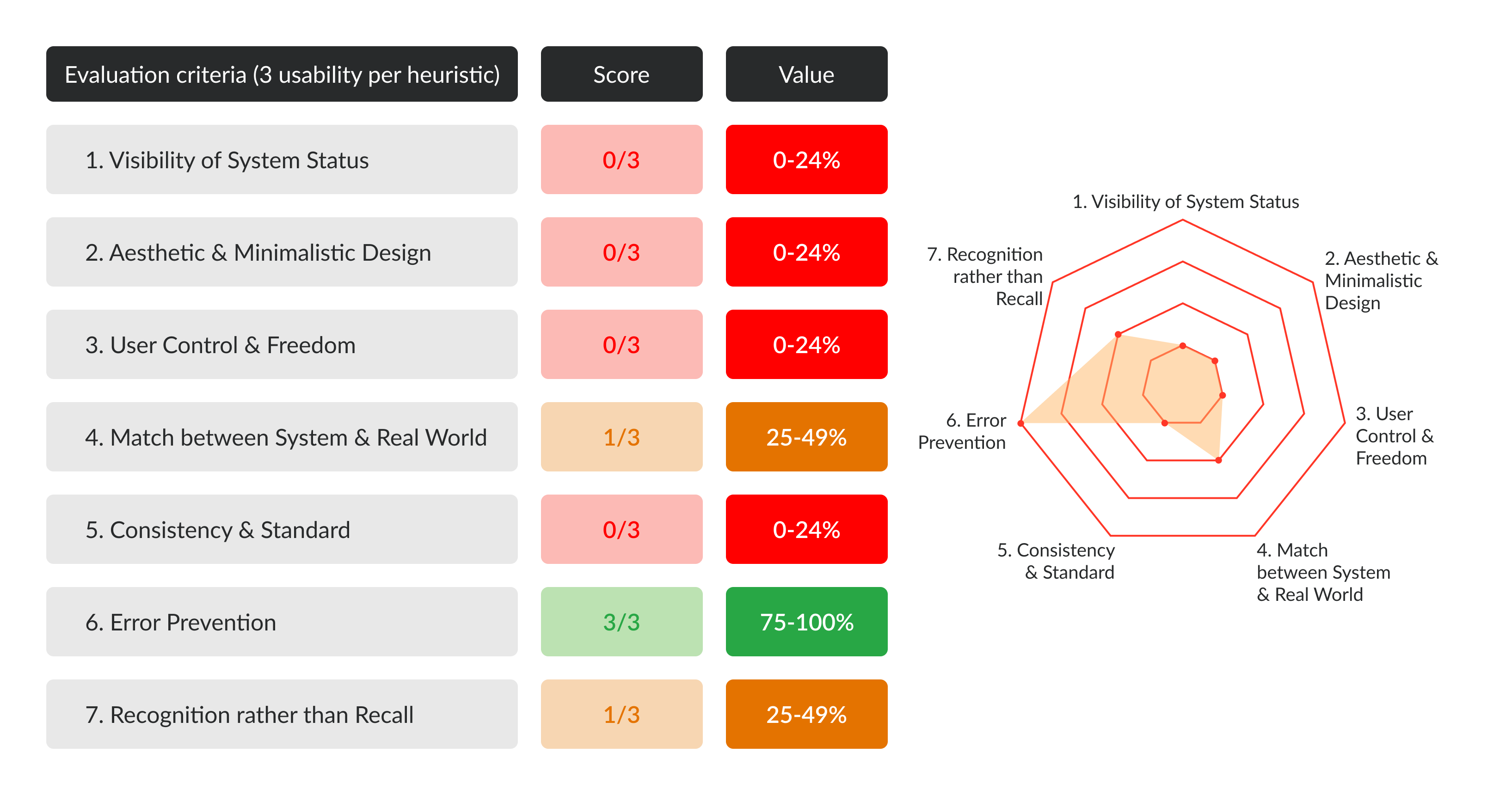
Heuristic Evaluation: As a preliminary research method, I used Jakob Nielsen’s 10 principles for interaction design as a guide and analyzed the current Daraz application screens to identify key issues and areas for improvement. I took 7 major criteria to analyze the UX and the UI of the existing app to improve it for the redesign. Here are my findings and the scores assigned for each criterion.
User Interviews: To tacke & understand the problem at the core I conducted user interviews with 5 people from different age groups and locations in order to get more insights into a better understanding of the problem. The interview usually went on for about 30-45 minutes and covered topics to get to the core of what users desire to achieve and what their problems are..
Understanding the problems our users faced
📄 Can't find categories
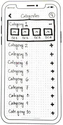
4/5 participants had difficulty finding the categories page.
😶 Can't edit items in cart
5/5 participants had difficulty deleting and editing items in their cart.
🧐 Can't read the text
3/5 participants had problem reading the text because of the font size or understanding the product name because of specific naming
😡 Can't reorder previous orders
4/5 participants were annoyed when they couldn't reorder the item(s) from their past orders or re-order the same order again.
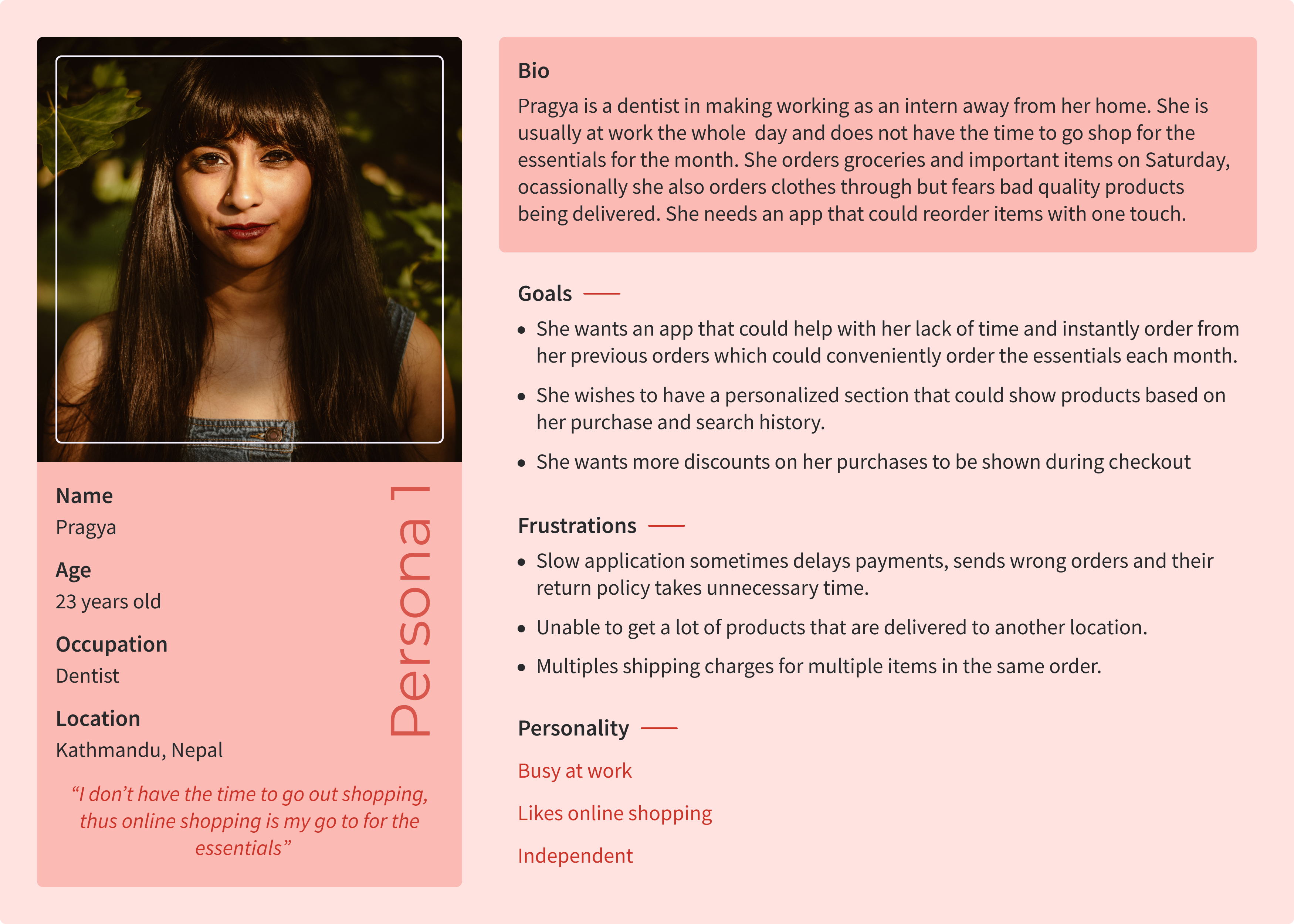
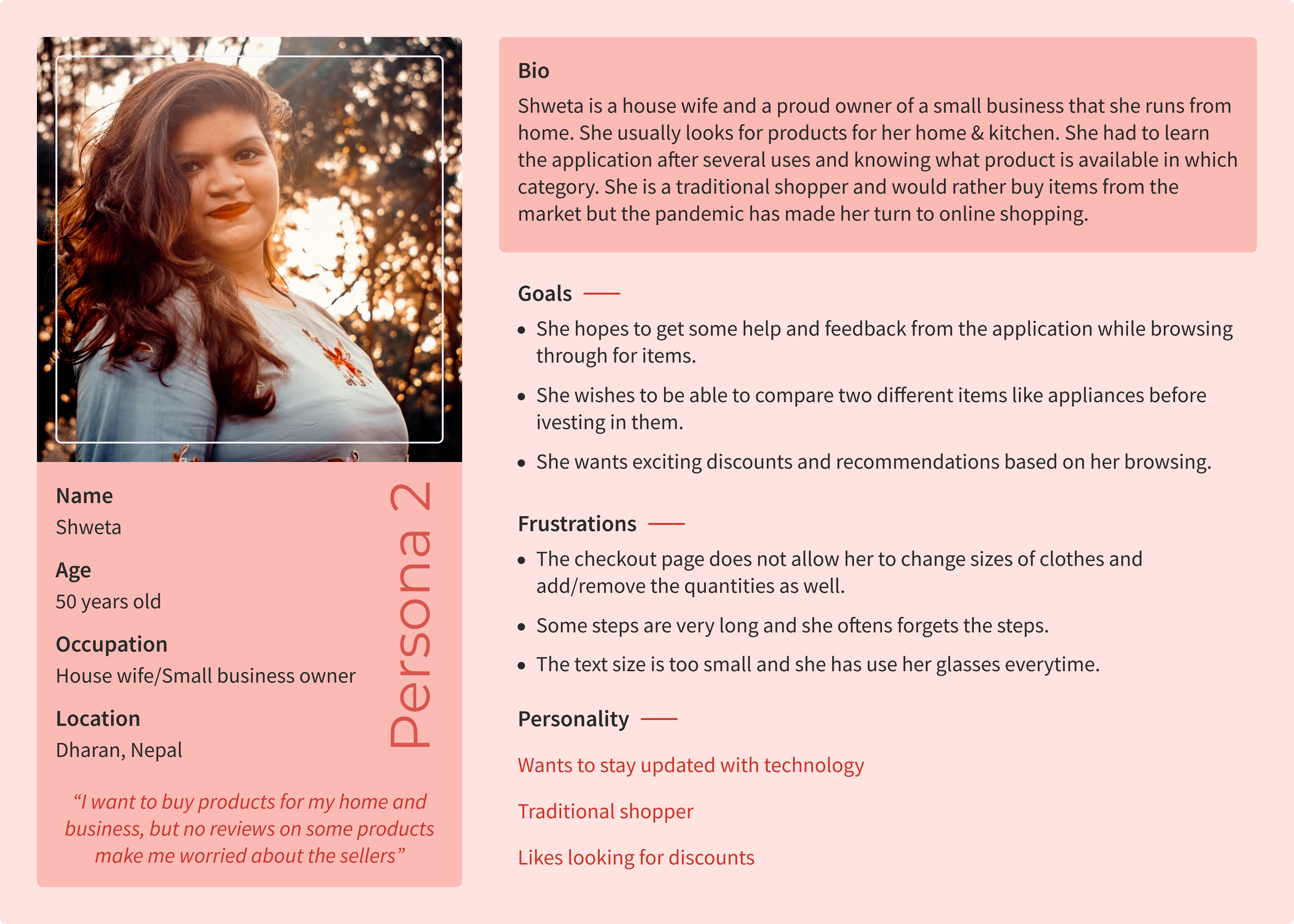
The users of Daraz
These personas mimicked the needs, goals, and pain points of the target users and helped me stay focused on redesigning the platform to serve the intended user base in a better way.
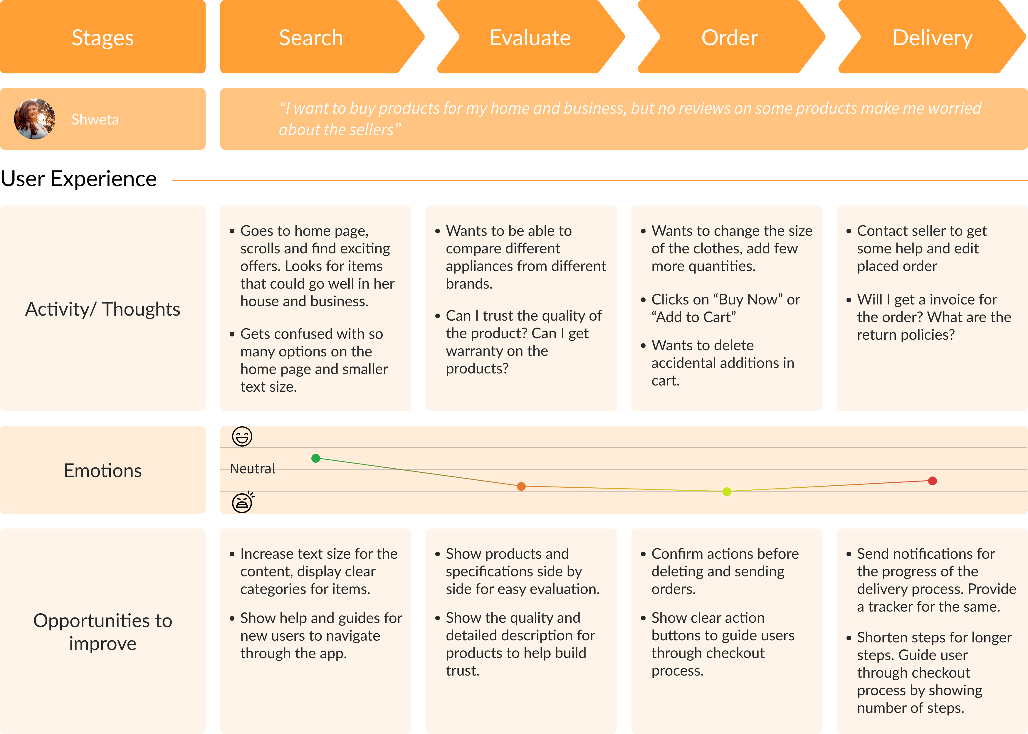
The Process
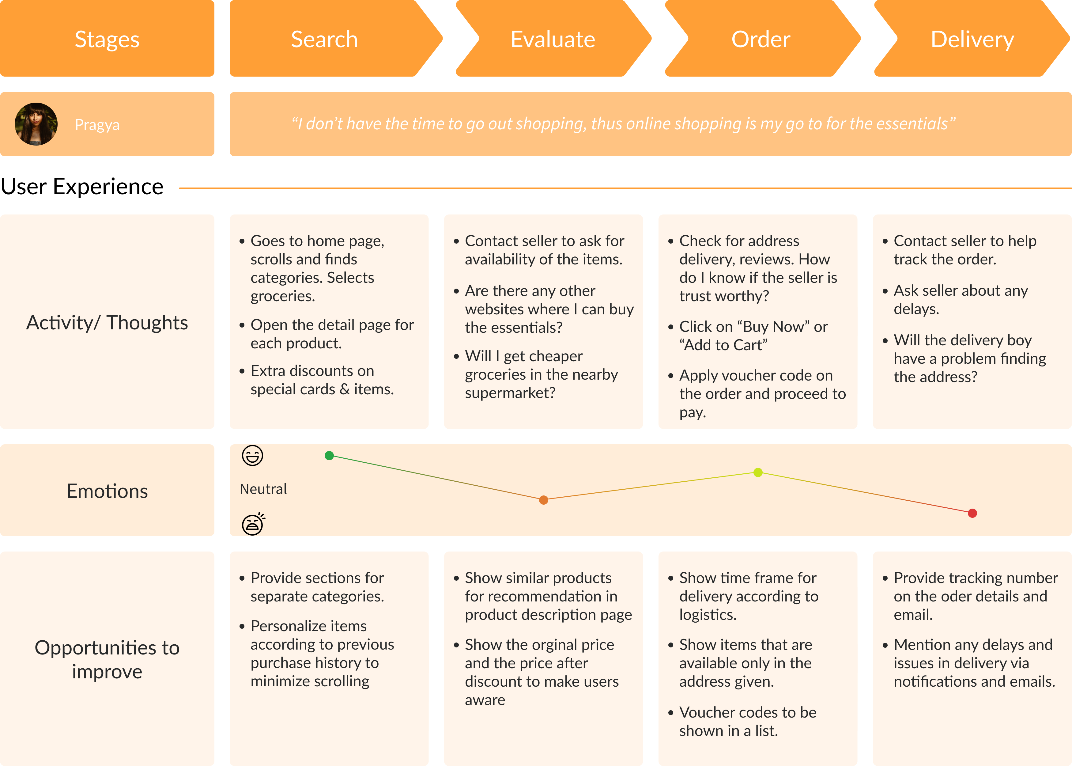
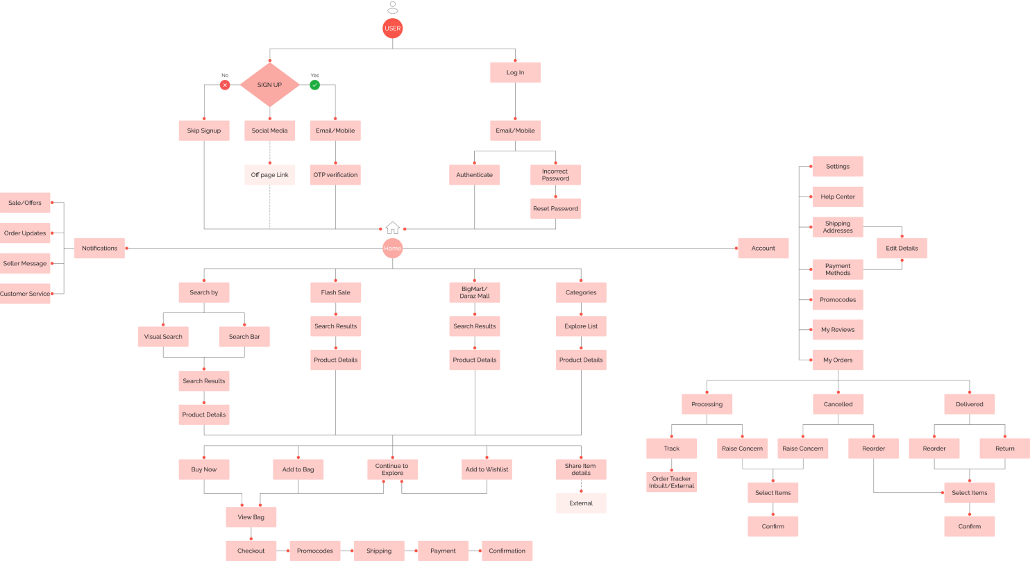
The exploratory research helped me define the focus areas for the redesign of the product. The app is very large for me to redesign every element, thus I chose to focus on some of the key elements and flows.
User Flow
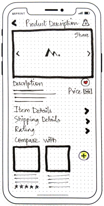
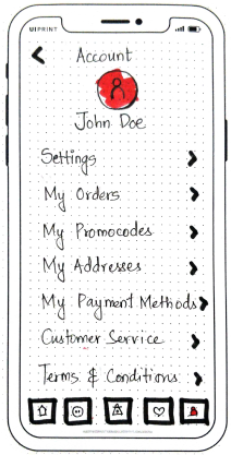
Lo-Fi Prototype
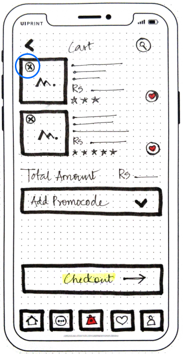
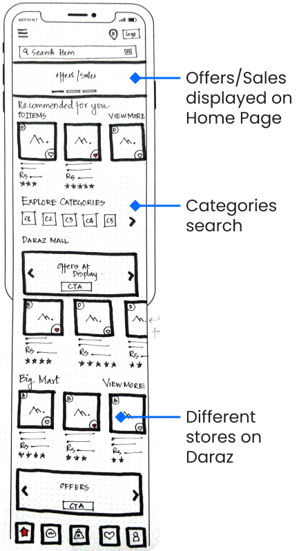
Using the storyboards and user flows I created, I moved on to create Lo-Fi Prototypes for the initial usability testing with our target audience (n=6). I gathered a lot of interesting insights from talking to our users and watching them interact with the screens.
Mid-Fi Prototype
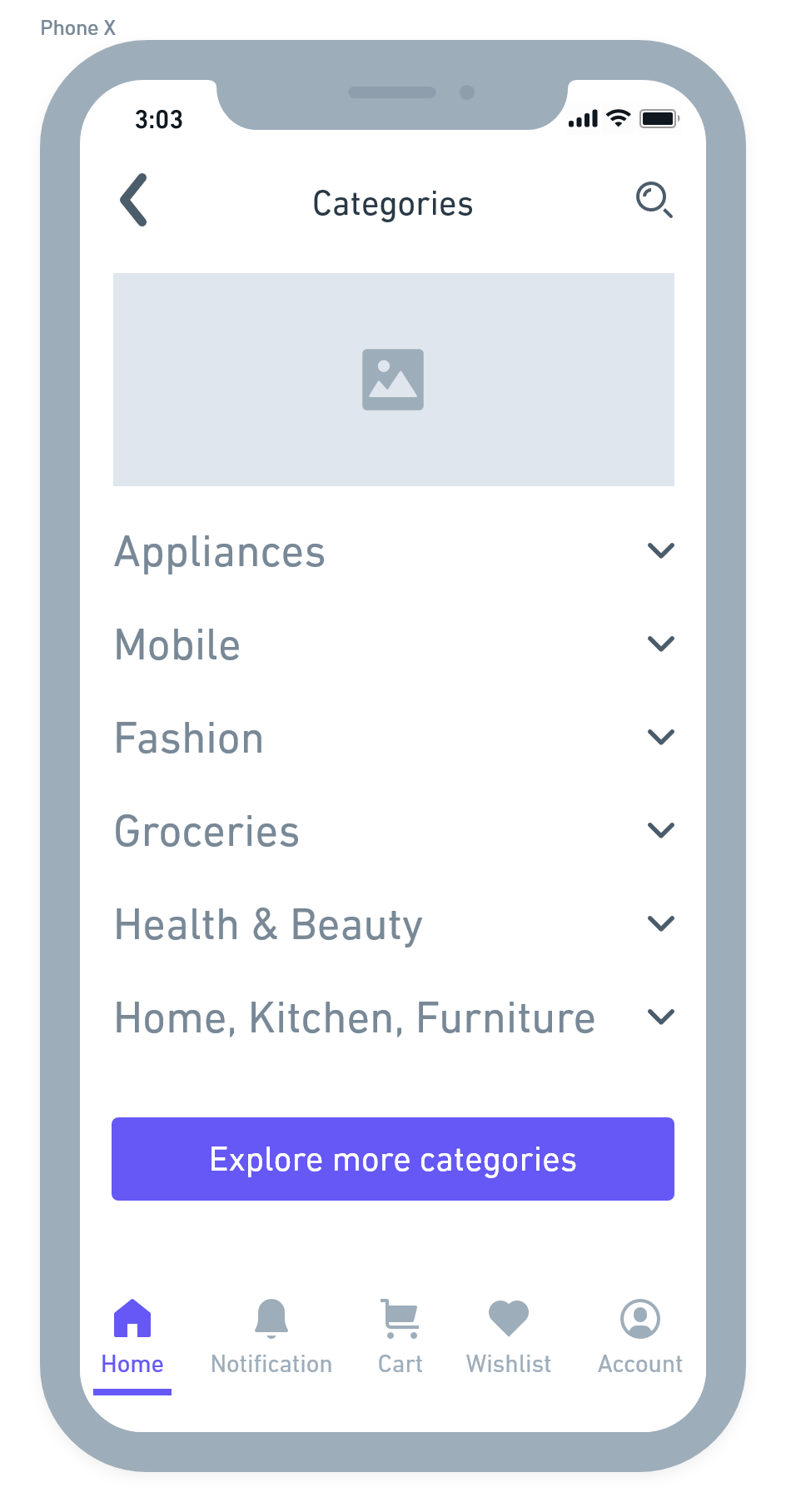
I integrated the findings from the Usability Testings to the prototypes and updated them into Mid-Fi Prototypes and then conducted another round of Usability Testing.

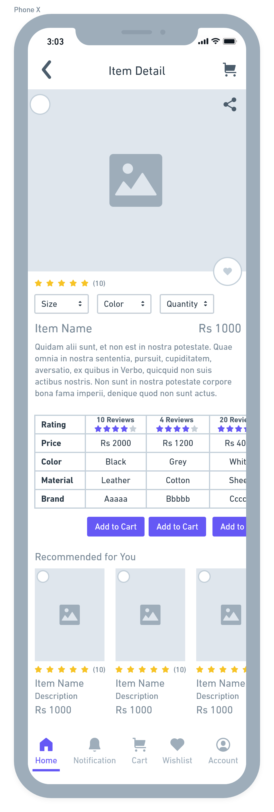
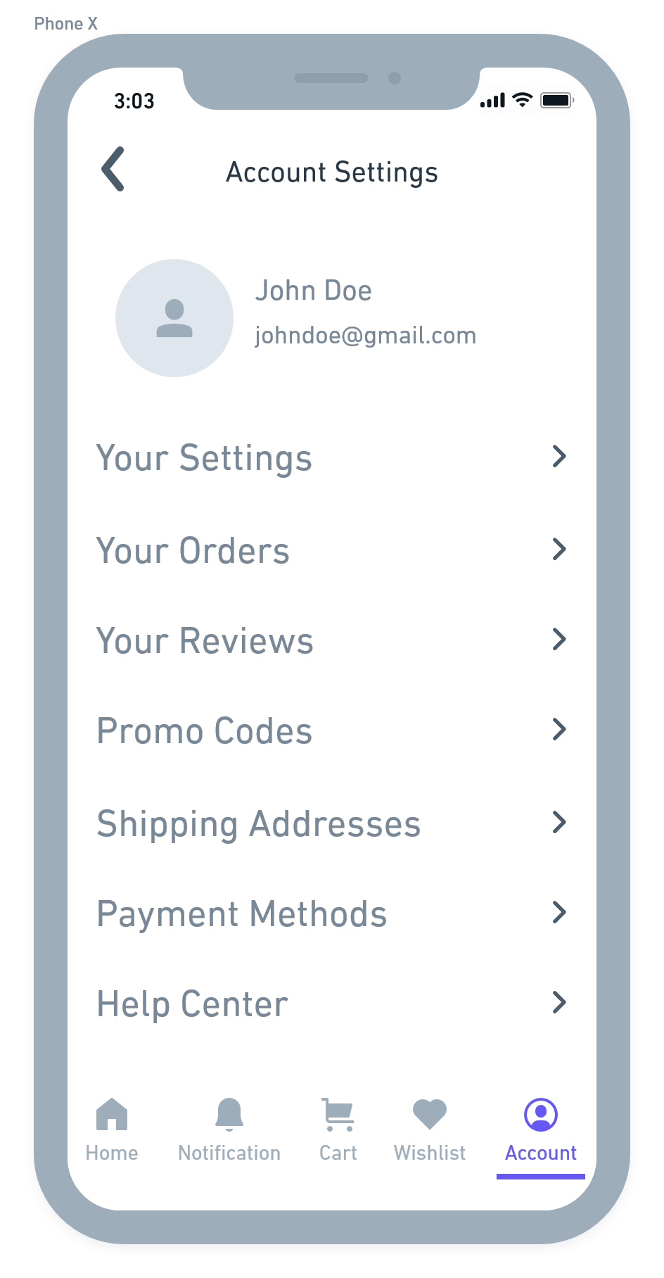
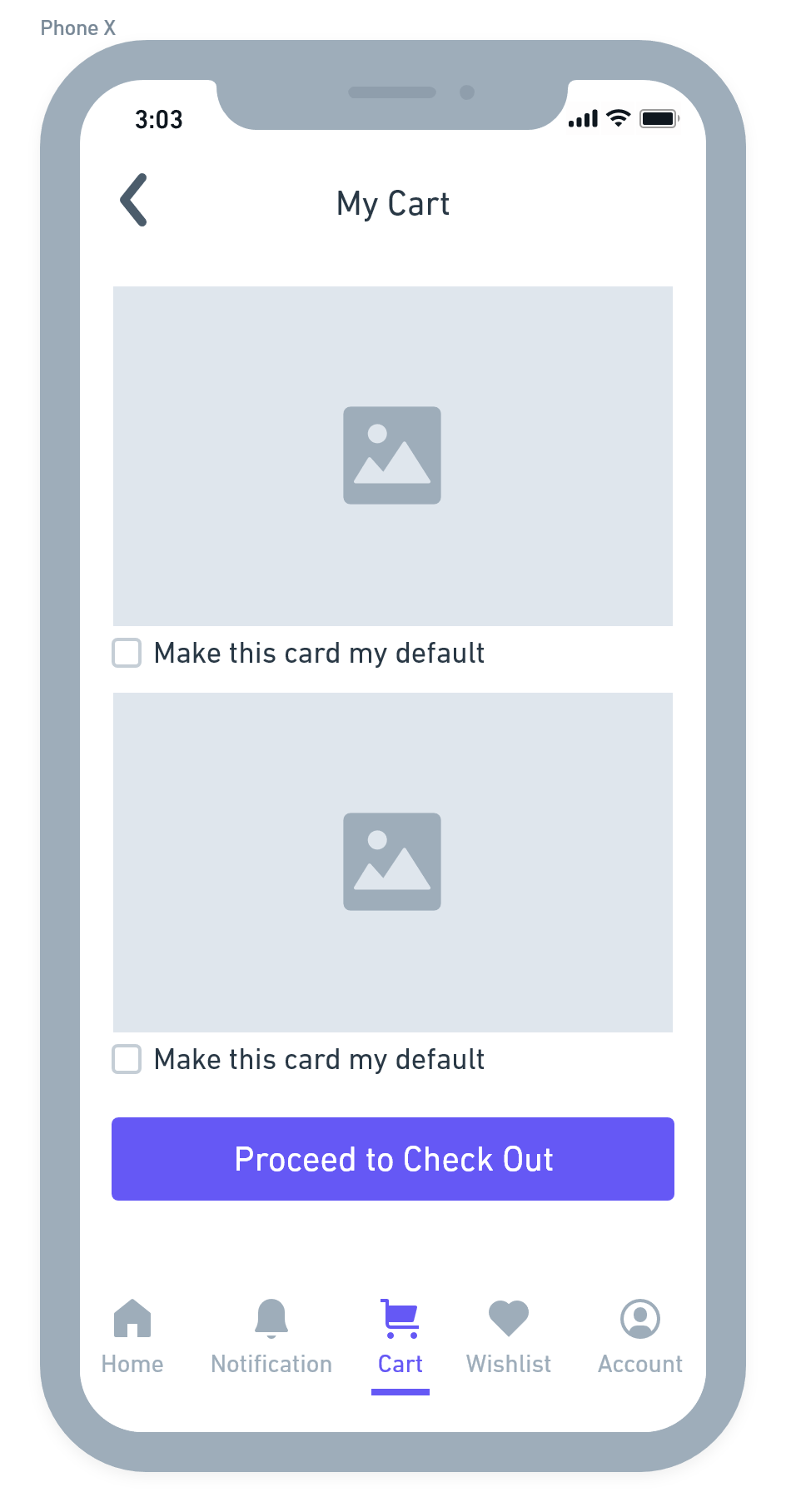
Highlights: Final Solution & Outcome
Each highlight captures an aspect of the new experience in Daraz. It calls out what user scenario or problem its solving and what the solution is.
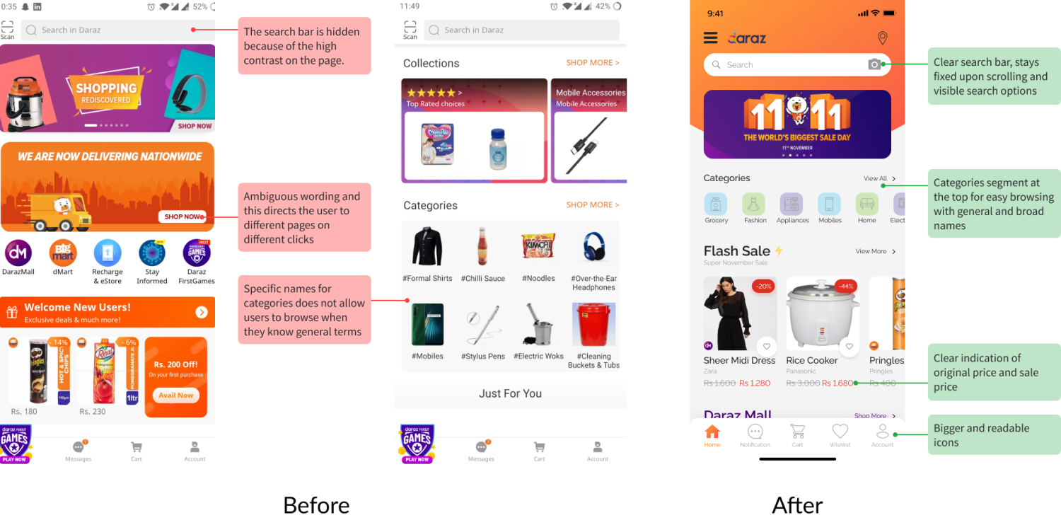
UX Suggestion: Home screen sorted out in sections to display information
The Problem
The problem is that users don't see th search bar easily because as the page scrolls up the search bar disappears. The ambiguous words of brands & categories makes it hard for users to find the products they are looking for. The sale banner takes the user to a different page each time they click on it making it a frustrating experience.
The Solution
I introduced home screen with a clear & sticky search bar, allowing users to see it even when are scrolling through the home page. I also added a categories segment for easy browsing with broade & general names. The icons in the redesign are bigger & text is easily readable.
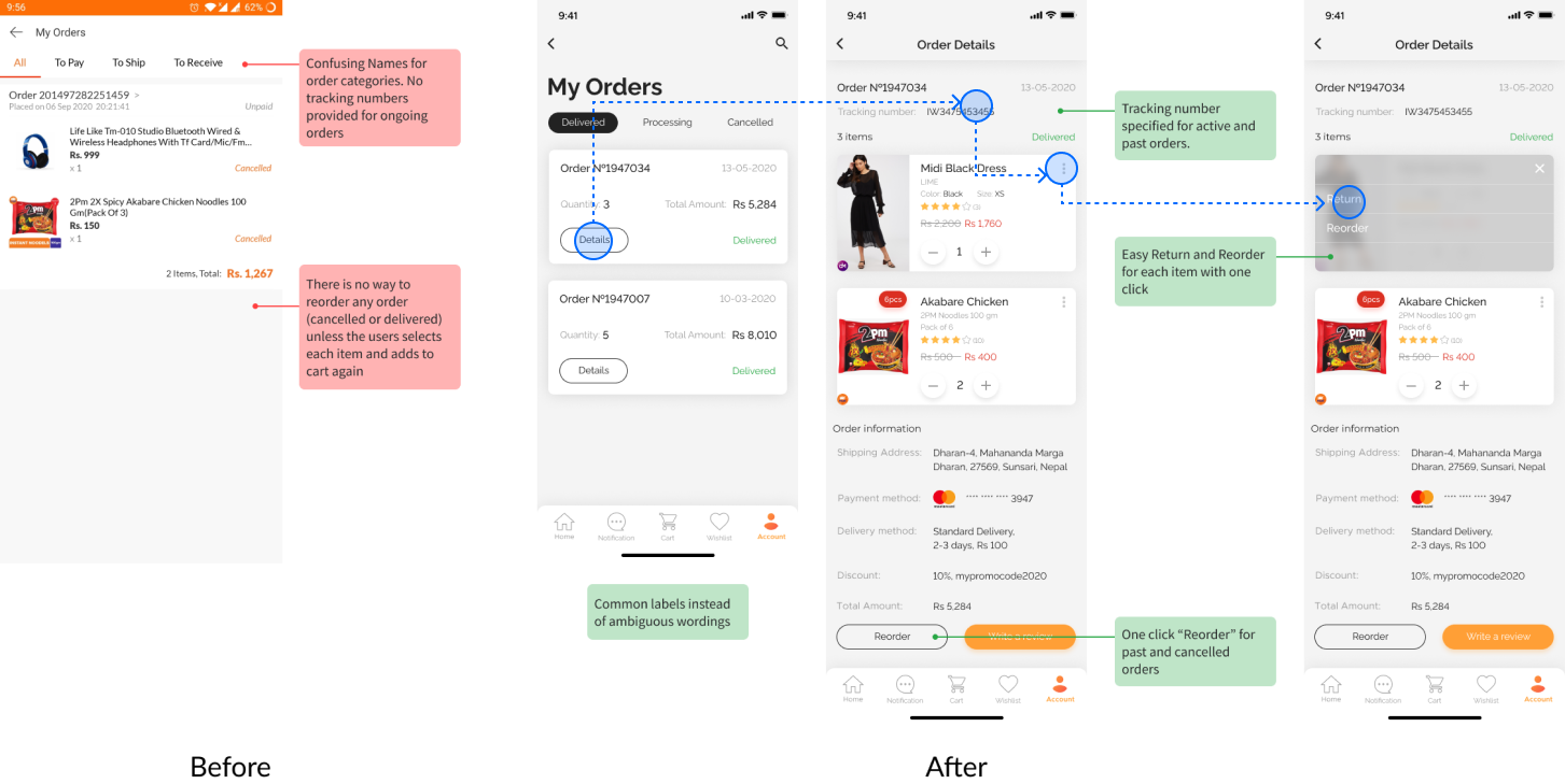
UX Suggestion: Reording a previous order, tracking an order & returning an item(s)
The Problem
The current workflow has confusing tabs when it comes to look for a tracking number after an order is placed. Additionally, there is no way to re order the same order or individual items of the order either after a cancellation or while placing a fresh order.
The Solution
To combat this issue, I introduced tabs that clearly distinguishes between the status of the order, i.e, Delivered, Processing & Cancelled. The tracking number is visible at each order page & the user can easily place a reorder for individual items of the previous order or the entire order.
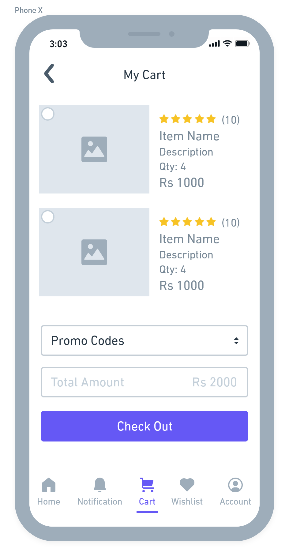
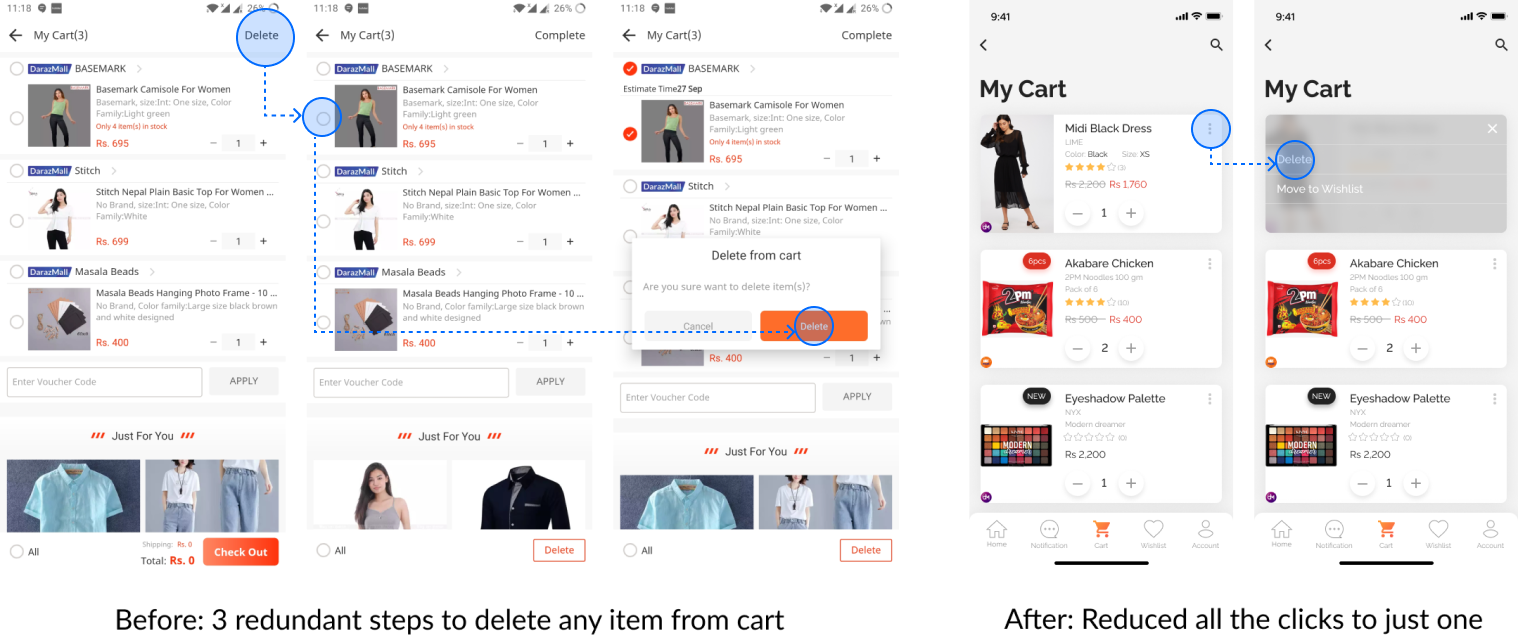
UX Suggestion: Deleting item(s) from the cart page
The Problem
One of the major issues users face is while deleting item(s) they no longer require from their cart. The current UX flow makes the user go through 3 redudant steps to achieve their goal, often times not giving hints for the steps.
The Solution
I reduced the steps allowing users to easily select the item(s) they want to delete from their cart. I also added an option for users to move items to their wishlist so that they can save it for future orders.
My Learnings
🤯 New levels unlocked
I was both excited and nervous about this project — excited because I was doing something I am passionate about and nervous because I knew this was going to be a lot of work. Despite my fear and nervousness, I knew this was the perfect opportunity for me to hone my design skills by making my way through the messy and exhaustive design process.
🏆 Result & feedback
This project was a 3 week design sprint organized by Daraz and my entry was selected as the top 3 entries. I received warm and helpful feedback from their design team for my submission.
Although I could not cover all the pages, I would like to keep working on these in the future. In conclusion, I had a blast doing this project and I hope you enjoyed reading about it too!
Powered by 
