
Axon DEMS Navigation
UX Design · Card Sorting · Usability Test · Navigation Design · Information Architecture · Web + Mobile
Introduction
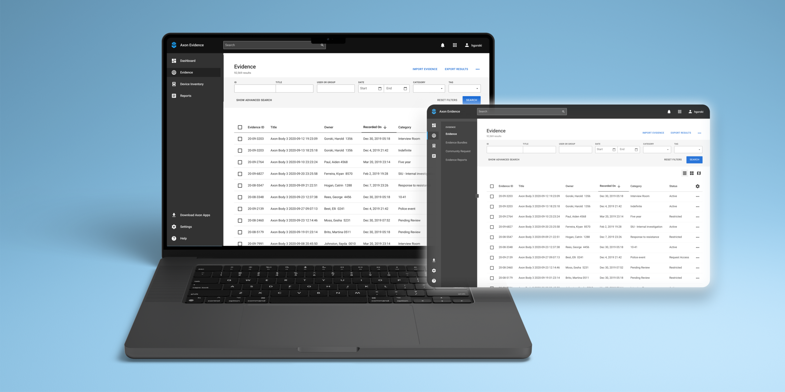
Axon Evidence - Digital Evidence Management Software (DEMS) currently follows a top horizontal navigation bar with primary level & secondary (also tertiary in some special cases) levels. Currently, there is no way to switch between other Axon products from the Landing Page except for some links like Axon Respond, and Axon Records from the navigation bar. Additionally, the information architecture needs some rework based on the user flows because items are distributed in different categories despite being a part of the same workflow.
To solve some of these issues an iteration of a new left-hand vertical navigation bar was created that would help categorize items using icons & allow product switching. Although a sudden change in navigation could lead to confusion, so we conducted an A/B test to see which navigation bar did well in some of the key tasks.
This project was executed in 2 phases where the first phase involved the prototype design & A/B test, the second phase was taking the insights from the A/B test, conducting another card sort & making a new prototype for 2nd round of usability testing.
My Role
Making interactive prototype, reviewing usability test videos, writing research plans & conducting card sort studies. Design explorations & making a new prototype for 2nd round of testing
Team
Solo designer, collaborating with UX Researcher - John Sykes, & a supportive team for critique & feedbacks
Timeline
Phase 1 - June 2022 - September 2022; Phase 2 - January 2023 - March 2023
Context & Problem
The legacy top navigation is used across many products in Axon but for this project, I was focusing on the navigation in DEMS which would be later scaled to other products too. We knew that there would be some hesitancy around adopting left-handed navigation vs. the legacy top navigation layout. Given our user’s technical ability, there might also be some concern that changing the Information Architecture from Tabbed top navigation to Left Nav may be too confusing to users. In order to ensure the best experience for our users, we ran an A/B test to determine which version of the navigation performs best at critical nav tasks.
How might we effectively transition from the legacy top navigation to a new left-handed navigation layout in DEMS, without causing confusion for our users, while still improving the overall Information Architecture of the navigation bar?

Process
Using the designed screens, I developed an interactive prototype that showcased the functionality of the new left-hand navigation for all the tasks we needed to test in 1 single prototype. The prototype was then employed in an unmoderated A/B test on UserTesting.com. As part of the update, I incorporated breadcrumb navigation into pages that required users to return to the previous page instead of the homepage. This not only helped users to navigate more efficiently but also allowed them to keep track of their location within the navigation.
Research Questions & Results
1. Which concept best aids users in navigating to key pages faster? Top Navigation
2. Which concept best aids users in navigating to key pages with the fewest errors? Left-hand Navigation
3. Which concept allows users to recognize and recover from errors more quickly? Left-hand Navigation
4. Which concept gives users a clearer understanding of their location in the website’s architecture? Left-hand Navigation
5. Which concept is more accessible for users? Left-hand Navigation
6. Which concept’s product switching method is clearer to users? Neither
7. Is there a subjective preference for design from inexperienced users?
Ease: Left-hand Navigation
Success: Top Navigation
8. Which concept is better at helping users find solutions for themselves? Equal
Understanding which version of DEMS Navigation worked the best for different tasks
Although the Left-hand Navigation passed in many tasks in the A/B test but it did fail in some very important areas. The discoverability of certain items on the information architecture was low.
🔁 App Switcher
During testing, most participants missed detecting the app switcher located at the top left of the Navigation bar due to its poor visibility.
➜ To improve visibility, an obvious clickable and detectable app switcher is needed.
⚙️ System Status & System Usage
Most participants perceived System Status and System Usage to be under System Admin in both versions of the navigation.
➜ It would be helpful to place System Status & System Usage under "Settings".
🤷🏻♂️ Confusing Choice of Words
"Inventory" felt very vague & confusing to users. To find the Body Work Camera (BWC) assignments participants looked into the System Admin.
➜ Change the name Inventory to Device Management, Device Inventory would give context to what is the kind of Inventory.
📍 Location-Based Evidence Viewing
The task involving finding location-based evidence was not completed by users. Participants looked at the evidence filter categories for this task.
➜ Location-based viewing needs to be added as an option in view tabs - list, icons, maps, etc.

THE APP SWITCHER & INVENTORY TASKS

THE LOCATION-BASED EVIDENCE SEARCH TASK
Card Sort Workshop
During phase 2, I invited designers from all pillars to participate in a moderated Card Sort activity with debriefing sessions at the end to sort the Information Architecture of DEMS Navigation. To carry out the activity, I drafted the card sort research plan and created the necessary cards. After a week of conducting the card sorts, I analyzed the quantitative and qualitative data to identify potential design directions for the new prototype. To further enhance our understanding of navigation patterns, I also conducted market research on various platforms such as Google, AWS, and Slack.
The primary aim of the Card Sort activity was to gain insight into how designers categorize various items in the navigation and their perspectives. Additionally, I wanted to determine how designers from other pillars integrated other Axon products with the navigation and how the navigation could be scaled to be more seamless in the Axon Enterprise.
Findings from Card Sort & Design Explorations
“Our users see Axon Enterprise as one & not different pillars, thus it is important to have seamless movement between different products, allowing no break in workflow” - P1 from Card Sort
Dashboard & App Switcher
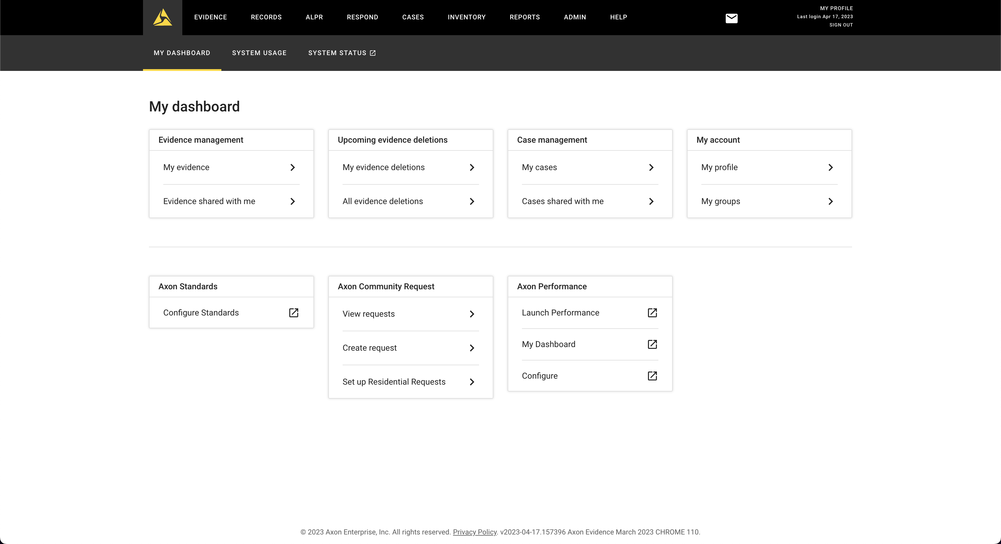
• Settings - The category formerly known as Admin has been renamed to Settings since users felt that Admin implies a role, whereas the items in Admin are settings. System Usage and System Status have been moved to the Settings category, as validated in the previous A/B test.
• My Evidence & My Cases - Participants placed My Cases and My Evidence under My Dashboard, calling them "tasks" assigned to them for a personalized experience based on their roles and permissions in the agency (Screen 2).
• App Switcher - All participants grouped Respond, Records, Download other Axon products, and ALPR in one category, and some also discussed the app switcher.
• Notifications - Release Notes is more of a notification kind of element, to know the latest updates/news of the product they are interested in.
• Most participants considered Download Axon products as a separate call-to-action button or placed it in Help or Settings.
• Some items, such as "My____" (cases/evidence/groups/profile), were placed in two locations - the dashboard (for my stuff) and their relevant categories like Evidence, Cases, and Settings.
SCREEN 1 - CURRENT TOP NAVIGATION WITH "ADMIN" TAB

SCREEN 2 - DASHBOARD WITH TASK LIST & MORE PERSONALIZATION (WIREFRAME)


Evidence
• My Evidence & My Cases - Participants placed My Cases and My Evidence under My Dashboard, calling them "tasks" assigned to them for a personalized experience based on their roles and permissions in the agency (Screen 2).
• Some items, such as "My____" (cases/evidence/groups/profile), were placed in two locations - the dashboard (for my stuff) and their relevant categories like Evidence, Cases, and Settings.
• Reports was considered to be kept under each major category to easily access reports. Eg - Evidence Reports, Device reports, Cases reports etc.
• Cases - A few participants noted that cases & evidences can be a part of the same workflow
🚨 Disclaimer - All the screens contain data from a test environment which does not belong to any real customers


Device Inventory
• Reports was considered to be kept under each major category to easily access reports. Eg - Evidence Reports, Device reports, Cases reports etc.


User Testing & Feedback 🔜
Upon completing the card sort activity and redesigning the navigation screens, my internship came to an end in March 2023. Following this, in April, the UX Researcher will be conducting a Usability Test during the company-wide event "Accelerate" to evaluate the effectiveness of the new design for users and determine if it overcomes the issues identified in the initial A/B test.
To be added soon..
My Learnings
🔑 Collaboration across teams is crucial
By recruiting designers from all pillars to participate in the card sort activity, I was able to gain a more holistic understanding of how the navigation should be structured. This collaboration across teams allowed me to create a more comprehensive design that met the needs of scaling the navigation to other products.
🧐 Conducting moderated studies
Through conducting a moderated card sort study, I was able to individually conduct sessions with each participant, allowing me to speak with them at the end of the session. This enabled me to gain a better understanding of the reasoning behind each participant's categorization decisions.
📄 Document your design process
Keeping detailed documentation of my design process helped me bring the phase 1 learning, and identify areas for improvement to make a research plan for phase 2 - card sort activity & redesign.
🙅🏻♀️ Don't be afraid to make changes
The project was completed in phase 1, and it needed updates based on A/B test results. But I decided to improve the design based on the feedback from designers, users & also competitive market analysis.
Powered by  & made with
  | Designed by Nisha Jain © 2026